This page is a collection of the best printer test images specifically aimed at photographers and those who want to set up their printers for printing photos.
There are many more printer evaluation images images freely available on the web, but these are a selection of the best available.
If you want a basic test printer image, then the first covers most bases. The remaining images are for completeness, and if you want to really delve into the weeds.
Use the accompanying notes for each image to determine if your printer is properly calibrated.
If you’re looking for a new printer, then I would recommend checking out my hands-on review of the Canon Pro 200 and 300.
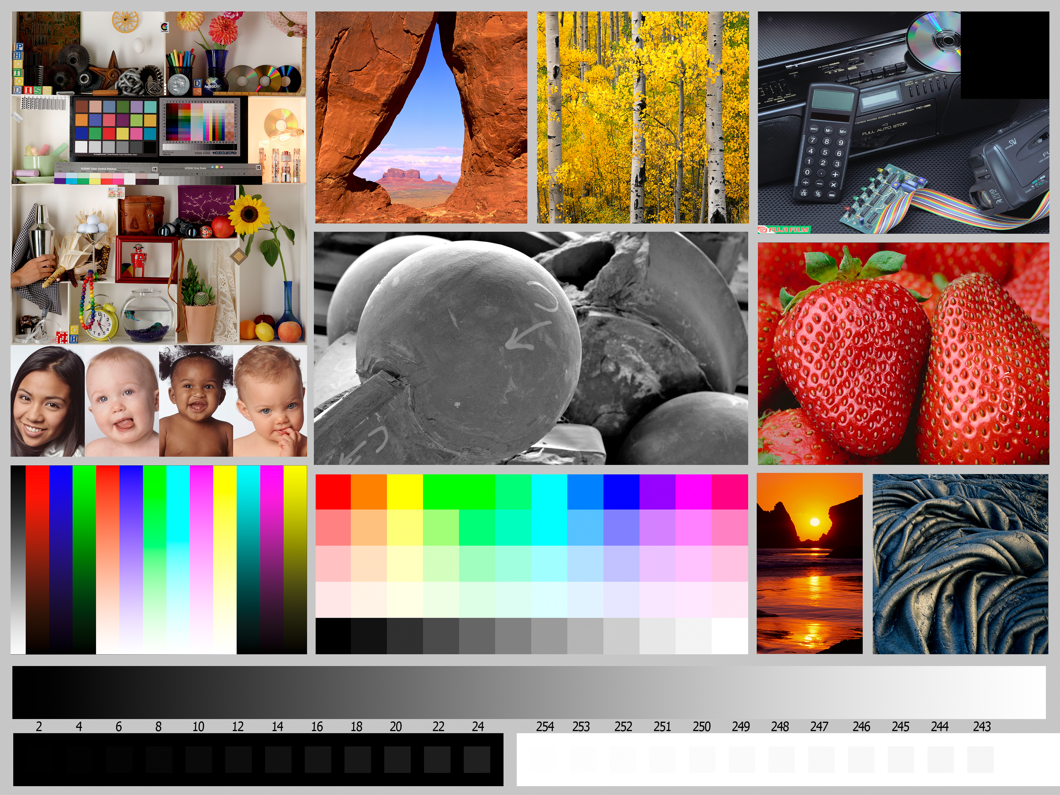
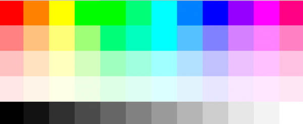
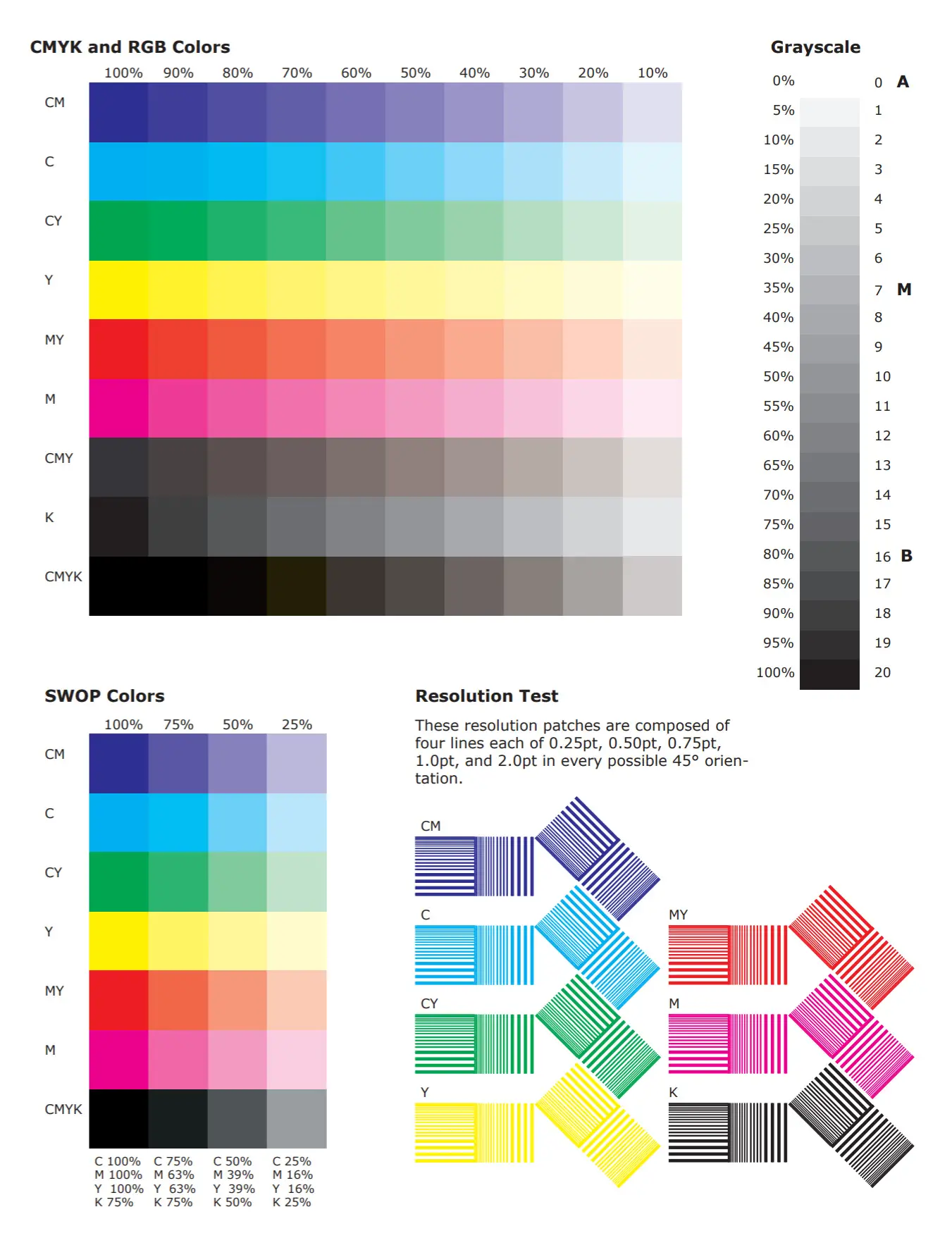
Color Printer Test Page
This color printer test page is based on images created by Bill Atkinson and a freeware image from Photodisc (which is available separately below).
https://www.lapseoftheshutter.com/wp-content/uploads/2021/08/color-printer-test-page.jpg
As with any picture to test your printer, you need to know what each part of the image is testing for the printer test page to be of any use.
I would look for:

- A smooth transition from black to gray to white in the gray ramp.

- As the gray squares have a more distinct tonal value, you can much more easily see any tonal shifts away from pure gray.

- You can determine your printer’s white point and black point from the bottom row. Note that the white point on the far right accounts for printers that add a Chroma Optimizer.
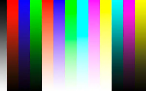
- The test color print gamut ramps show up any banding as well as any issues with color accuracy – you should check that the red, green, and blue are actually that. Most printers show some banding, so this isn’t a problem unless severe, or there is an inversion, where brightness shows variable levels as the color gets more saturated.
- The RGB test image should show good separation between the colors, with no bleeding into adjacent squares.

- The four people are useful for checking skin tones. This should be very obvious to you if it is incorrect. In particular, watch out for the skin tones going too yellow/green or blue.
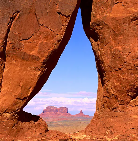
- The image of the rock arch actually has a slightly cyan sky. This is very useful for checking color shifts, but make sure to always check it against your calibrated monitor.
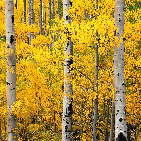
- The trees show a lot of fine detail, in addition to giving a burst of bright yellow.
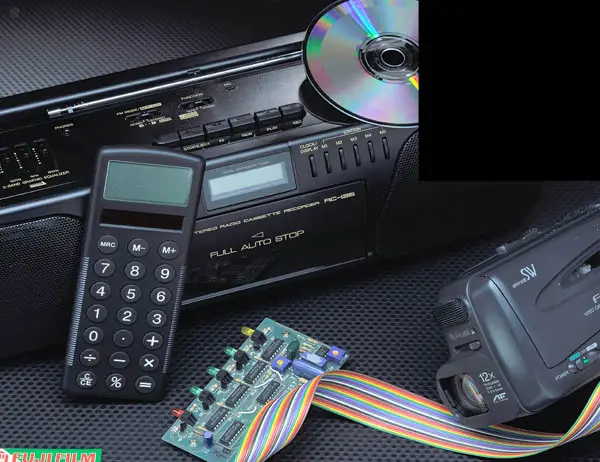
- The electronics are useful for shadow detail. The black square in the top-right helps you set a black point if you are using a colorimeter.
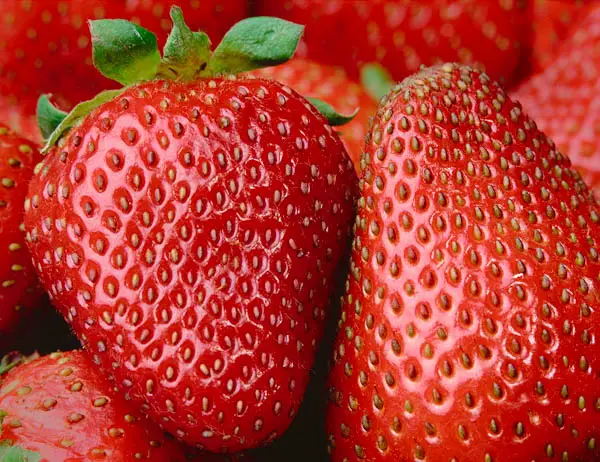
- The strawberries help you see if the reds are printing properly. It’s always easier to see this with a real object, as you can quickly tell whether the strawberries look edible or not!
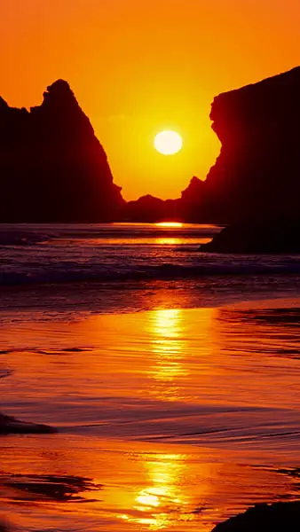
- The high saturation of this sunset image may cause some banding on your print. This is very useful to see the real-world banding experience.
- The rock has plenty of shadow detail and a bronze highlight. Cheaper printers often display this bronze color as more green or yellow.
- This black and white image displays a full gradation of tones from white to black, betting showing you how this is handled on a real image.
High-Resolution Color Print Test Image
This printer color test image is from Photodisc, now owned by Getty, and was released under a freeware license, so you are free to use this as you wish.
This is an excellent printer calibration test image because it really covers every real-world situation you might find yourself printing, and is ideal for laser printers as well as standard inkjets.
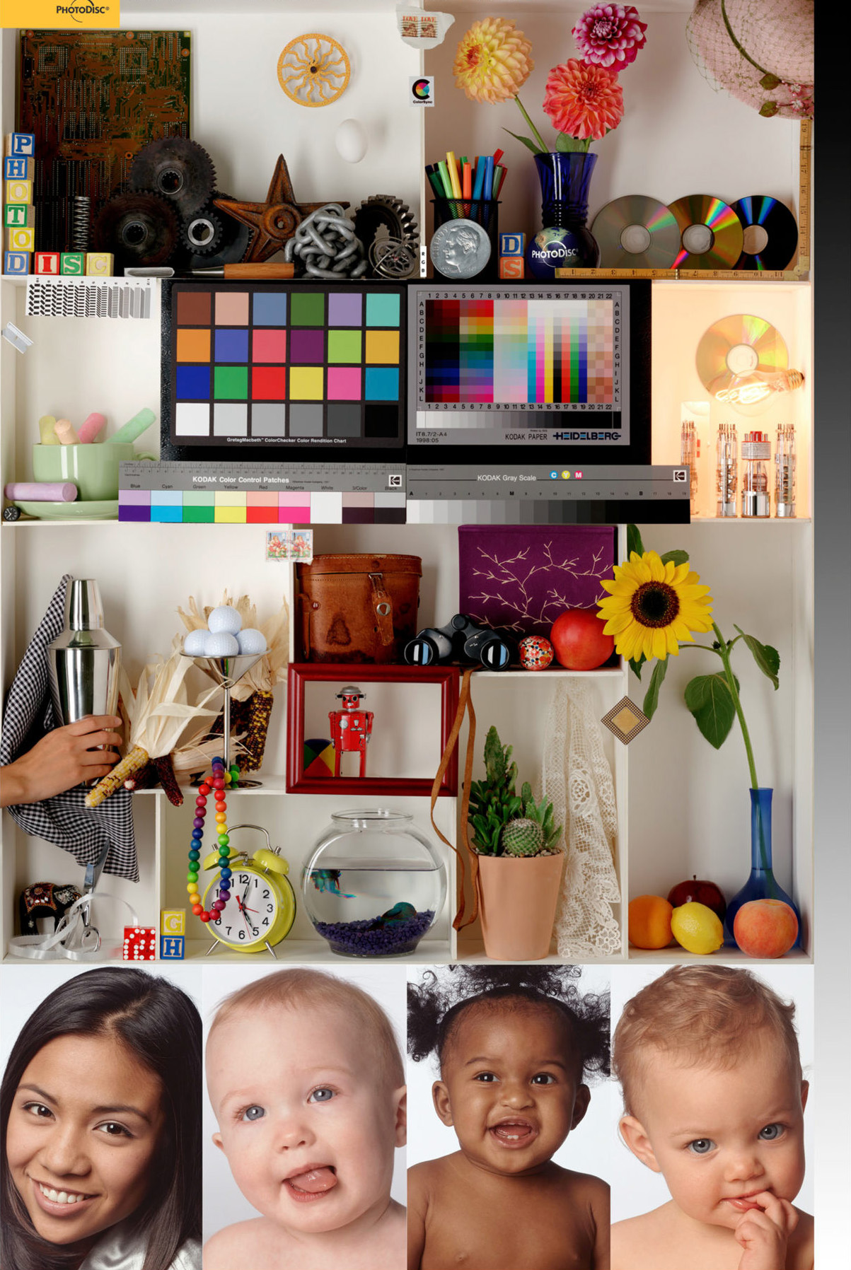
https://www.lapseoftheshutter.com/wp-content/uploads/2021/08/printer-test-image.jpg
In this image, look for:
- Middle Section
- The yellows in the sunflower should be bright and distinct from the yellow of the lemon below it.
- The vase holding the sunflower should have good saturated blues.
- The shadow areas of the fruit should display correctly, with no problem tones.
- The cactus and the sunflower leaves should show a rich range of greens.
- The binocular case has deep brown tones that transition well into the darker areas.
- The robot has bright, saturated colors that still show detail, as do the colored beads.
- The elephant shows good detail in the colored saddle, with no bleeding from the blacks.
- The optically brightened golf balls should have cool blue highlights.
- The purple tapestry and the sand in the fish bowl should have deep purple tones with plenty of detail.
- Right Hand Side
- There is a smooth gray transition in the gray ramp, with no banding or breaks.
- Bottom – Faces
- Skin tone in both the highlighted and shadow areas should look natural, especially the difficult pink skin tones in the second face, and the areas where the skin transitions into the hair on the third face.
- Dark areas in the hair of the first model should show detail without going to pure black.
- Overall
- There should be a good range of varying warm highlights in most areas.
- Pay attention that the tint of the shadows in each box is subtly affected by the contents of each box.
- The colors all match what you see on your monitor (assuming you have a color-calibrated monitor).
Fuji Printer Color Test Chart
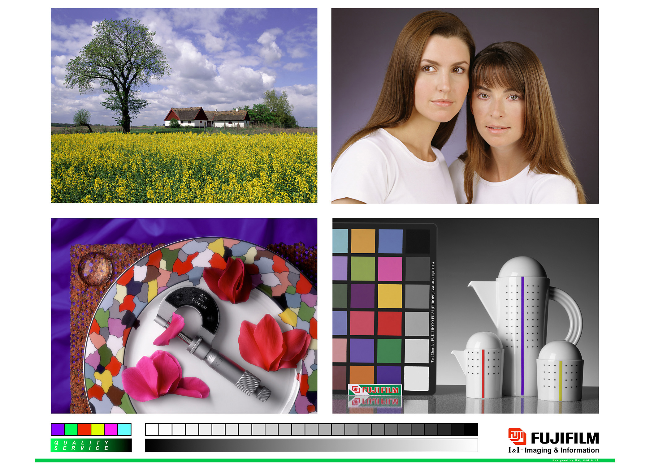
https://www.lapseoftheshutter.com/wp-content/uploads/2021/08/printer-color-test-chart.jpg
The below image was produced by Fuji for calibrating their printers, although it does have issues with the color space – look at the color of the sky for example and you will see that it is more purple than blue.
Nonetheless, this image is included for completeness, but should not be relied upon on its own. Although it is not as useful for printing, it can be useful for checking monitor calibration, however.
Printer Resolution Test
https://www.lapseoftheshutter.com/wp-content/uploads/2021/08/print-resolution-chart.jpg
PDF for CMYK Colors
It’s important to run a printer resolution test to determine how good your printer is at picking out individual details.
The following printer test image PDF is courtesy of cream.sourceforge.net.
This can be downloaded as a PDF for CMYK colors to be used as a color test page, or as a full-size jpg.
Black and White Test Print
If you’re looking to print a test page in black and white, then there are several excellent resources to help you.
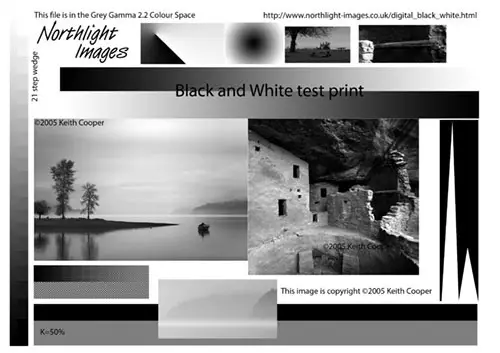
Keith Cooper at Northlight Images has several monochrome printer test pages, including the one on the right.
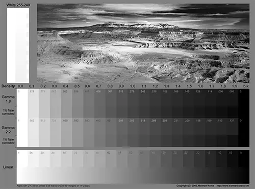
Norman Koren also has a number of excellent black-and-white printer test charts, such as this one.
Read More:
What’s the best photo printer?


![[SOLVED] Sony TV Turns On By Itself?](https://www.lapseoftheshutter.com/wp-content/uploads/2021/10/sony-tv-turns-on-by-itself-340x226.jpg)
8 Responses
Duncan
was excited to find your page as I need to do some colour testing and calibration, however you may want to include some images with true CMYK values if wanting to best test and calibrate your printer… sorry if I missed some, but they all seemed to be RGB.
Tim Daniels
Hi Duncan
The image under ‘Printer Resolution Test’ contains CMYK colors in the document – the JPG version is saved as RGB, but the PDF can be opened as CMYK.
I’ve updated the link to make this clearer.
Misael
Hey Tim,
this is very helpful, however, I can’t download these as JPGs, only as webp files, could you perhaps add a more clear link to a JPG/PNG download?
Thank you so much!
Tim Daniels
I think my caching service must be converting these to webp.
Try right-clicking on the link and opening from there.
I’ll also add the actual JPG location as text beneath it so you can just copy and paste that into your browser if the above doesn’t work.
Z
very helpful! Thank you so much!
Tim Daniels
Thanks!
Antonio R
Thanks for sharing your knowledge.
I found your page a few years ago and was able to download the test print file in jpg with srgb color space.
Now, the Chrome browser only allows you to download the file in webp format and when you open it in Photoshop, it indicates that it does not have any embedded color space.
Maybe you could put a link to a compressed jpg srgb file.
Again, thanks for your help with the color.
Tim Daniels
You can do this in Chrome.
Copy and paste the link beneath the image file into a new tab.
Then press Ctrl+S or go to the three dots in the top-right -> Save & Share -> Save page as..
And it will save as a JPG.
I guess it’s a Chrome “feature” to save in WEBP when you right-click.