Part 2: Landscapes Masterclass
Table of Contents
- Part I:
- Part II:
- Part III:
- Part IV:
4. Lightroom (or Adobe Camera RAW)
Lightroom has become a super-powerful and indispensable part of most landscape photographers kit in the last few years. If you’re not a regular user of Lightroom, or someone who has never used the develop module in it, you might be surprised at quite how powerful it is, and how many Photoshop-like tricks are available if you know where to click. The only major thing that Lightroom can’t do, but Photoshop can, is layer masks. The functionality of Lightroom and Adobe Camera RAW are the same, so if you only have Photoshop, you can still follow along.
Subscribe to the mailing list and get a free download link right now
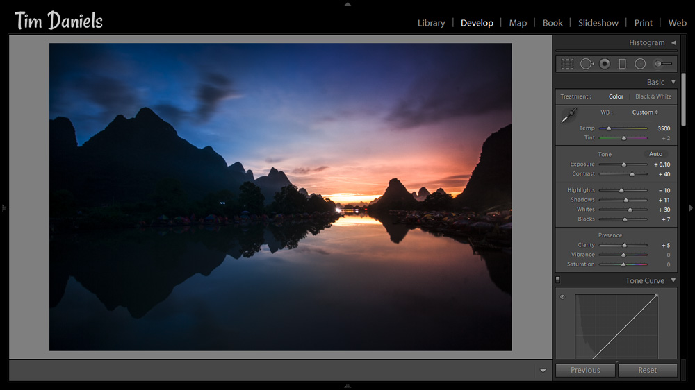
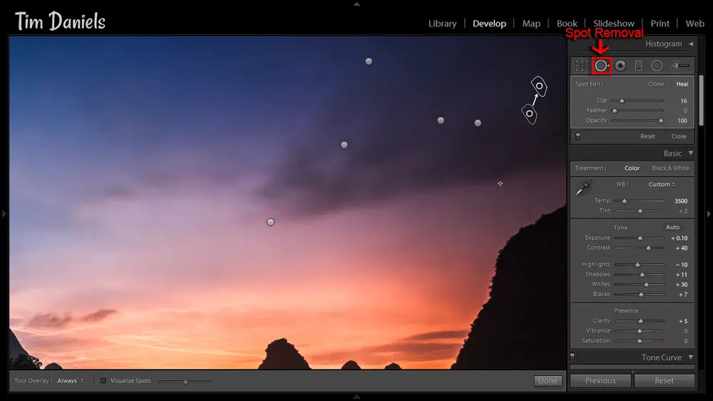
So, open Lightroom, select the photo that you want to work on (or the free photo for following along) and click on the Develop module. Your screen should look like this:
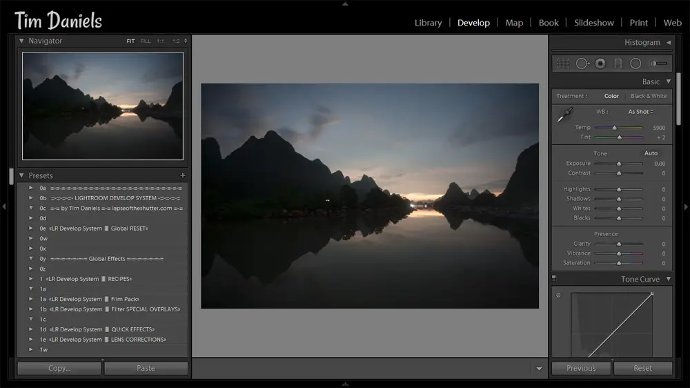
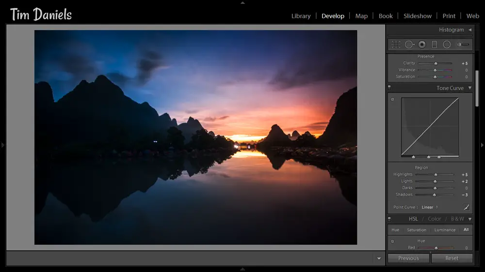
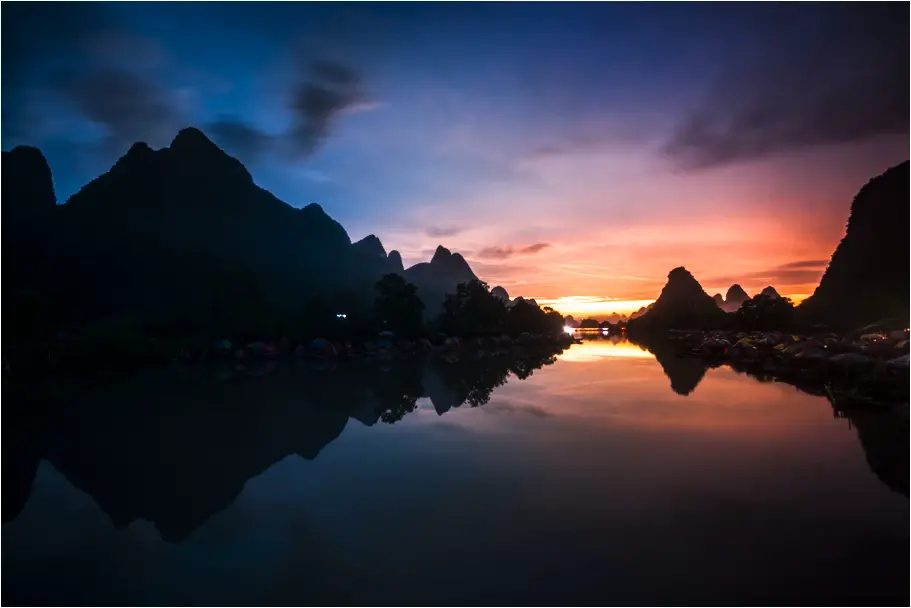
I took this photo somewhere in the Chinese countryside along the Li River. It was pretty dark, and I was pretty tired from cycling on a little pedal bike with no lights, so I cranked the ISO up and only shot a 30 second exposure. With hindsight, I should have kept the ISO low and shot a long, four or five minute exposure, but I wanted to get back to the hotel without experiencing too much of the wild terror of cycling along Chinese roads in the dark. I also wanted dinner. That always speeds up the whole photography process, doesn’t it?
Even with the technical flaw of high noise, it’s still possible to turn this photo into something you would be proud to show off. Although you should always aim to get it right in camera, many small problems are fixable now in Lightroom and Photoshop. So don’t get rid of a photo just because it doesn’t seem perfect at first. You can do a lot more than you think.
5. The Most Important Slider
The single most important slider is White Balance, and I bet that most of you haven’t been using it to it’s full potential.
White balance sets the warmth or coolness of the photo. Generally, we use the main slider to set the white balance globally, for the whole photo at once, but it is possible to target white balance adjustments, so different parts of the photo have a different white balance. This lets you make some pretty unique and powerful effects, and makes each photo individual and personal to you.
Try this:
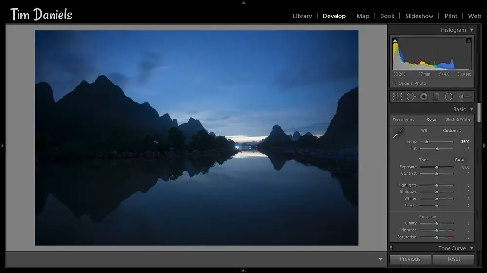
Push the white balance slider in one direction until you think it looks good, then keep going, even if it looks awful.
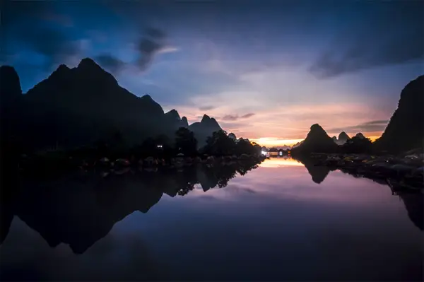
There’s an example using the Li River photo above. It has an extreme effect compared to the original. Maybe you think it’s too much, so what can you do?
Try this:
Click on the Graduated Filters and Radial Filters, push their white balance sliders to the opposite extremes, and use them to recover the white balance, layering the filters as you go.
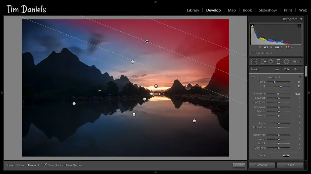
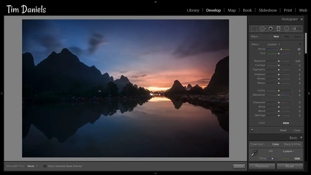
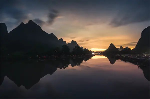
With a few clicks, you can create areas of warmth and coolness in your photo. See it in action above, and the finished result below.
Tip: Increase the Clarity and Contrast sliders on the filters for an even more impressive effect.
You’ve just added colour depth to your photo. This is just the tip of the iceberg when it comes to colour. To get a more in-depth look, see the Add Colour Depth Through White Balance tutorial.
If this seems too complicated, try the totally free Lightroom Develop System which has multiple versions of these effects built into single clicks.
with Graduated & Radial filters to recover white balance
A reminder: the Add Colour Depth Through White Balance tutorial covers this in much more depth.
Subscribe to the mailing list and get a free download link right now
6. Finalising in Lightroom
So, you’ve added some colour depth to your photo without touching any of the main sliders in Lightroom, apart from white balance. It looks pretty good, but there’s still lots more we can choose to do. To finish your photo, it’s easiest to mentally divide Lightroom into four main areas: Dynamic Range & Structure, Colour Grading, Stylisations and Tidying Up. Thinking of it like this, it shouldn’t take you longer than a couple of minutes to get through all of them.
Dynamic Range & Structure
There are eight sliders that control dynamic range & structure. The goal is to give your photo punch and contrast, and to make sure there is still detail where you want it, with balanced lights and darks. It’s completely ok to have areas of pure white or black, but these sliders will help recover any you don’t want:
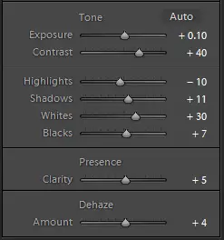
- Exposure: Small changes, if any, are all that is needed for this slider. Most photos only require adjustments like +/- 0.10 at the most, as long as you properly exposed the photo when taking it.
- Contrast: Increasing this along with clarity and dehaze adds punch to a photo, but going higher than +30 or +40 often creates an unattractive effect.
- Highlights: When highlights lose detail, pushing this slider to the left helps you recover it.
- Shadows: Brightening shadows too much gives a very unnatural, low contrast effect. Small increases work best, so that you recover details in shadows, without losing too much contrast.
- Whites: Sets the white point for your photo, how much detail you see in bright areas and determines contrast when set against the blacks slider. A good starting point is to increase this slider by pushing it to the right, up to the point where highlights become pure white and start to lose detail. If you’ve shot in a very bright environment or you see too much pure white in your photo, you can decrease the white point slider to restore detail in whites.
- Blacks: Sets the black point for your photo, the detail you see in dark areas and sets contrast with the whites slider. A good starting point is to lower this slider until the first point of pure black appears in a photo, and detail disappears. For photos shot at night or shot underexposed, you will probably have black in your photo before moving this slider. In this case, you might want to increase the black point slightly to reduce the amount of pure black in your photo. Photos can seem a bit flat if they have too much pure white or black.
- Clarity: This adds punch to a photo. Pushing it high creates a grungy effect. For most landscape photos it’s best to be delicate, but cityscapes with lots of detail and texture can take much higher amounts of clarity.
- Dehaze: A new feature in Lightroom, it creates powerful contrast when increased in small amounts.
and there are a handful of ways of combining these sliders to create different effects. To create an HDR effect for example, try reducing highlights, increasing whites, reducing blacks and increasing shadows. There are seven recipes at varying strengths, including HDR, low contrast and high contrast effects, in the Lightroom Develop System, available for free.
If you’ve used the graduated and radial filters to make targeted clarity and contrast adjustments, you shouldn’t need to make any large changes to the main dynamic range & structure sliders. For this Li River shot, I chose the “High Contrast (Brighten) – Strong” effect from the Lightroom Develop System, which boosted exposure and contrast.
Subscribe to the mailing list and get a free download link right now
7. Colour Grading
Colour accuracy is extremely important in landscape photography. But sometimes it can be hard to figure out exactly how to get the colours you want. The Lightroom Develop System has hundreds of free colour grading presets for all of the most common landscape photos. In Lightroom, colour is controlled by the vibrance and saturation sliders (which are usually too general to be much use) as well as four main groups of sliders:
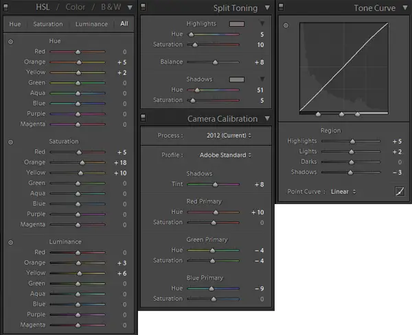
- Hue, Saturation & Luminance (HSL): HSL should be where you start your colour grading. It enables you to change individual colours and so offers the most control of any of the colour grading slider groups. It’s usually better to increase the saturation of these individual colours than use the main, global saturation and vibrance sliders. Remember, if you increase luminance, a colour appears less saturated, so you will often want to increase saturation and luminance sliders together. Find what you think is the dominant colour in your photo, then try increasing saturation and luminance slightly, and maybe try playing with the hue slider until you get something you like the look of. Repeat with the two colours either side of the dominant colour.
- Split Toning: Split-toning has a reputation for Instagram-style effects. But try using it with the sliders set to an amount of 4 or 5. It can add a subtle warmth to shadows or really bring out the blue in a sky if used in small amounts.
- Camera Calibration: This is less useful than HSL, but can be used to finalise a colour grade if you can’t get quite what you want with HSL. Sometimes, extreme changes in hue can have unexpectedly useful effects, so experiment.
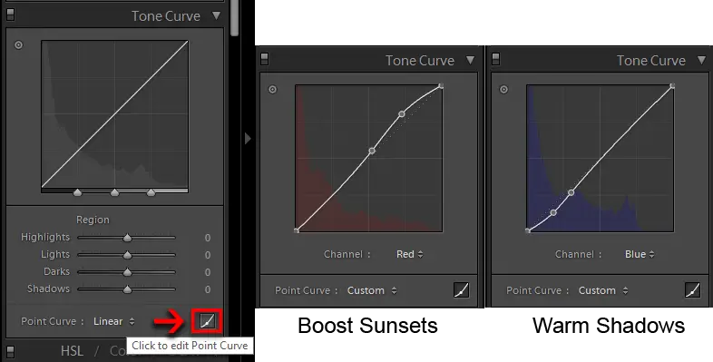
- Curves: Curves gets overlooked as a colour grading tool, but it isn’t just for contrast. Click on the small symbol in the bottom right and you gain access to the individual red, green and blue curves. Give the red curve a kick in the highlights to boost sunsets and reduce the blue curve in the shadows to add warmth to shadows.
For the Li River photo, I gave the reds, oranges and yellows a slight boost with the ‘Sunset Boost (Vivid)’ HSL landscape colour grade preset in the Lightroom Develop System, ‘Red Sky Boost’ in split-toning, and ‘Highlights Boost’ in Curves. This is quite an extreme effect, even for me. I would usually be more subtle, but here I want to emphasise the effects so that you can clearly see what is going on.
Subscribe to the mailing list and get a free download link right now
8. Stylisations
When you’re happy with dynamic range and colour, you can add more personal touches like vignettes, sun flares or light leaks. As always, there are plenty of stylisation presets and brushes in the free Lightroom Develop System. These stylisations aren’t appropriate for every photo, and I haven’t added any to the Li River photo.
Tidying Up
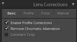
Make sure you’ve checked the box to remove chromatic aberrations, and applied lens corrections if you want to. Any big areas of dust you can remove with the spot removal tool. Sometimes this doesn’t work too well, but Photoshop has much more powerful dust removal tools, if you need them. Also, if you have shot at high ISO, push the noise reduction sliders up until most of the noise disappears but stop before the details in the photo become soft. Adding large amounts of sharpening can offset some of the loss of detail of noise reduction, but I usually leave both noise reduction and sharpening for Photoshop, where you have much more control.
9. Result
You’ve now finished processing one photo in Lightroom. Congratulations!
If you love the photo you have produced, you can stop here. Hit export, save as a jpg and post it on the Internet for all to see. But you don’t have to stop here. Why not try exporting that photo (most usefully as a TIFF), then hit the reset button and try again, but this time make different choices. This is called Double Processing. Do something different, maybe it will be better, maybe worse. Regardless of what you might read online, there is no right or wrong way to do things, so try, see what happens.
Here are two more versions of the Li River photo I produced, entirely in Lightroom. This is the benefit of double processing:
If you have shot multiple, bracketed exposures of a scene because of very bright sources of light, copy and paste your Lightroom settings between exposures, and export all of them. If you have double processed a photo, and want to learn how to blend them, you can in Part 3.
If you’re not feeling confident about using Lightroom, or you want a prompt, or you just want to speed up, try the totally free Lightroom Develop System, a guided tool to help you develop photos in Lightroom.
OK, so you have one (or more) photos. I’d recommend exporting them as TIFF files at this stage, rather than jpgs, but it doesn’t really matter either way. Maybe they’re good, maybe they’re great, maybe they’re … not. Now what? Don’t worry, perfection is only a Photoshop away!
On to Part 3.
Leave a Reply