The Landscapes Masterclass
Table of Contents
Part 4: Perfecting the Details
You now have one image, properly blended. Looks pretty good, but it could still be better. Let’s perfect it. To follow along with this tutorial, and also to power up your processing in Photoshop, take a look at the free resources available in the library, the Photoshop Colour Control ActionPack and the Photoshop Landscape Colour Grades. Just like with Lightroom, you can speed through Photoshop with confidence if you divide your workflow into four areas: Colour, Tone, Stylisations & Tidying Up.
The Photoshop Color Control ActionPack contains 17 powerful actions to control color and tone and finalise your photos.
14. Perfect Colour
Now that you are in Photoshop, you have much finer control over colour than in Lightroom, making colour grading a simple and painless process. There are all sorts of ways of modifying colours, from the basic Vibrance adjustment layer to Colour Lookup Tables. There’s far too many to go into detail on how all of them work here, nor do you need to know how most work. On their own, these tools can be useful, but they become essential when combined with selection methods like Luminosity Masks or Saturation Masks. You can learn more about using saturation masks to colour grade here.
Put simply, saturation masks are a selection method that allow us to easily shift colours to our liking. They work even on low dynamic range photos, giving you selections based on how saturated a colour is, not the colour’s brightness. They can be very useful when luminosity masks or other selection methods fail, or if you only have one exposure and want to make a fantastic photo without blending. I mostly use them for the stage of processing that comes after blending, and that’s how we are using them here.
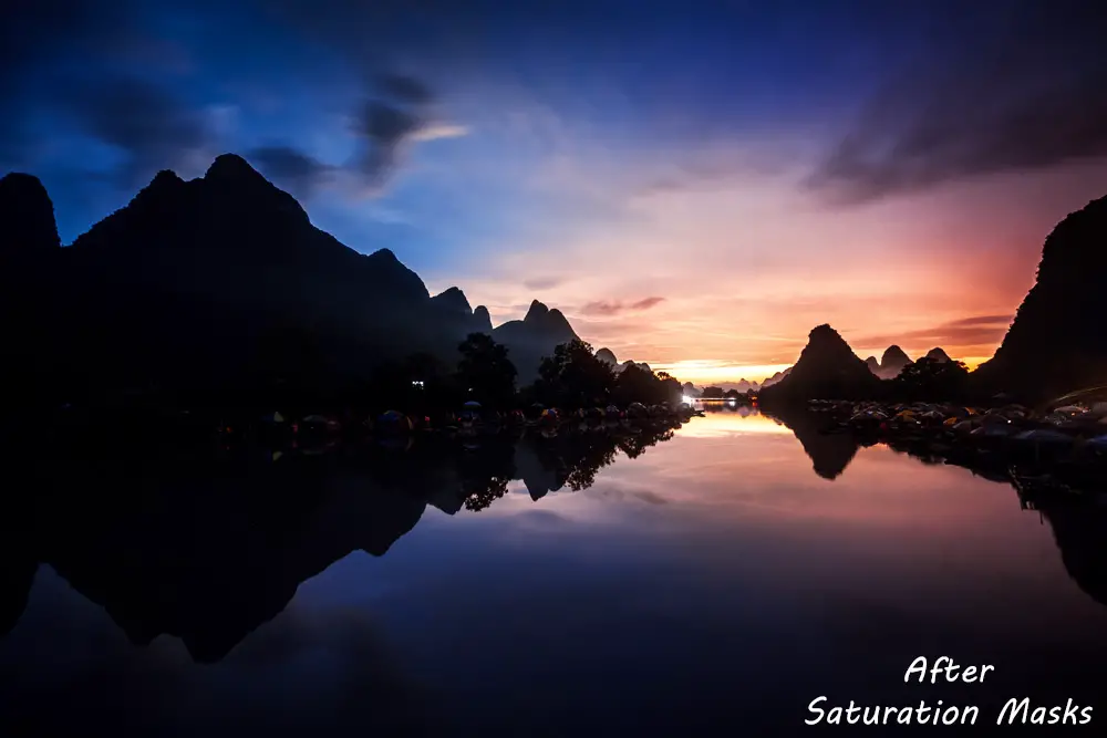
Let’s see an example of how I would perfect colour in the Li River photo.
- Create Saturation Masks (or learn more about how to make your own here)
- You can view the Saturation masks in the channels tab. The High Saturation masks are white where the colours in your photo are most saturated and black where they are least saturated. The Low Saturation masks are the opposite. Using both gives you a lot of power in changing the colour and tone of your photos. For more details, take a look at the Tutorial on Saturation Masks. You only need remember that the higher the number next to the Saturation Mask, the wider ranging any effects on your photos will be. With a little bit of practice, you can easily learn which mask is most appropriate for colour grading.
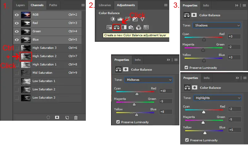
Colour Grading High Saturation Colours through a Colour Balance adjustment layer 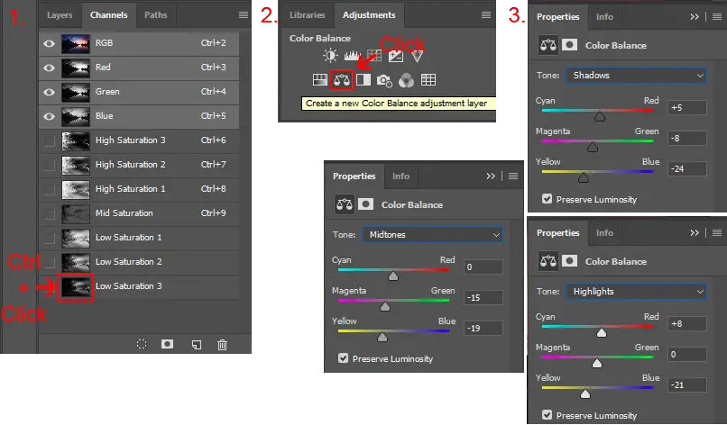
Colour Grading Low Saturation Colours through a Colour Balance adjustment layer For the Li River photo, I chose the ‘High Saturation 2’ mask, by ctrl-clicking (cmd-click on Mac) and then adding a ‘Colour Balance’ adjustment layer, which I used to modify the sky and water colours.
I repeated this process with the ‘Low Saturation 3’ mask, using ‘Colour Balance’ to make the sunset pop.
It is much easier to see this in action. Take a look at the two-and-a-half minute saturation workflow video below to see for yourself.Saturation masks are incredibly powerful and allow us to make all sorts of changes to a photo that we wouldn’t otherwise be able to do, and this is just a basic outline.
To find out how powerful saturation masks can be, read the Get Colours Like the Pros article, and to jump straight to using saturation masks yourself, download the Photoshop Colour Control ActionPack.
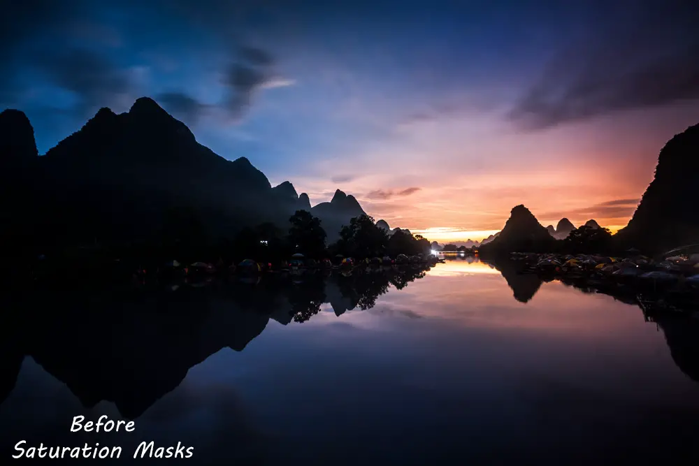
And here’s the result of that simple colour grading using saturation masks. When used properly, Saturation masks let you get colours exactly how you want them, every single time.
Subscribe to the mailing list and get a free download link right now
15. Perfect Tone
The general tone, dynamic range and ‘feel’ of your photo should be already complete, thanks to Lightroom. But it can often help to use Photoshop to power up specific parts of your photo.
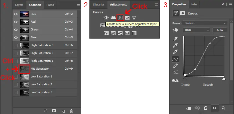
- Adding Basic Contrast: An easy way to add contrast is to select the ‘Mid Saturation’ mask created through the Photoshop Colour Control ActionPack, and add a ‘Curves’ adjustment layer. Use your own judgement and set the curve where appropriate, but I find that a strong ‘S curve’ often works well. You can also try using high and low saturation masks with ‘Curves’ adjustment layers for even more targeted tone adjustments.
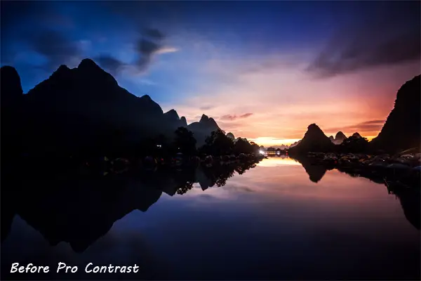
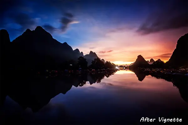
- Adding Pro Contrast: To create a more powerful contrast / detail boost layer:
- Merge Visible to New Layer with ctrl-alt-shift-e (cmd-alt-shift-e on Mac)
- Apply Gaussian Blur with radius 1 pixel
- Apply the High Pass filter with radius 100 pixels
- Apply Unsharp Mask with amount 500%, radius 1 pixel and threshold 0
- Set the layer to Soft Light blending mode
- Use your judgment to reduce opacity to whatever looks good to your eyes. Use a layer mask to paint out any areas you dislike, or apply the Render – Clouds filter to the layer mask to randomly remove and enhance the pro contrast
- Too much? You can get a free action that does all this in the Photoshop Colour Control ActionPack
- Non-Destructive Dodging & Burning: Very few photos are complete without Dodging & Burning, the art of painting light and dark into a photo. The aim is to bring certain areas to your viewer’s attention, and push other areas into the background, to create a 3D, textured feeling in your photo. First, you need to create new layers to non-destructively dodge & burn:
- Create two new layers, named ‘Dodge’ and ‘Burn’
- Hit shift-f5 to open the fill layer dialog and fill each layer with contents 50% grey
- Set each layer to Soft Light blending mode. (Use Overlay for a stronger effect)
- Use the Dodge and Burn tools on the new layers for non-destructive dodging and burning
- For a free action to create these layers for you, get the Photoshop Colour Control ActionPack
- Use the Dodge and Burn tools to accentuate areas where shadows and light intersect. Aim for subtle enhancement. There isn’t much use for it in the Li River photo, but I heavily used non-destructive Dodging & Burning in the below photo of Santorini. Compare the before and after and see the Dodge & Burn layers for an example of how you should use it, particularly in the foreground of this photo.

The Dodging Layer 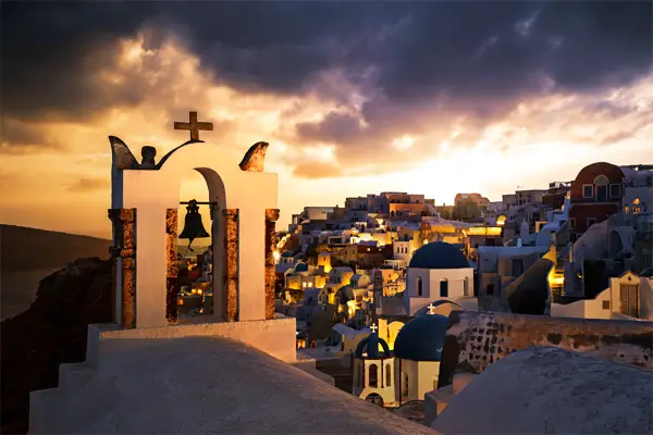
Without Dodging & Burning 
The Burning Layer 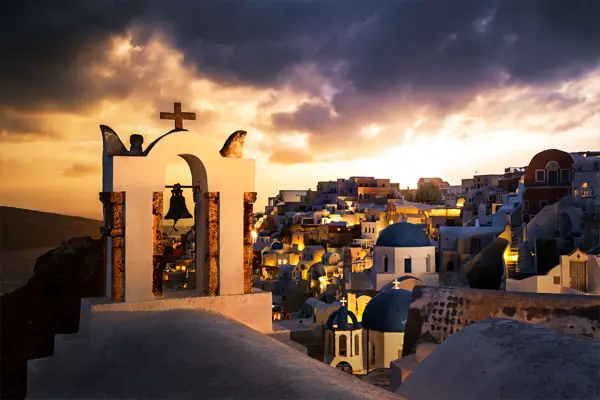
Final Version, with Dodge & Burn

16. Stylisations
Adding vignettes or highlight glow can really help to finish a photo, directing your viewer’s gaze and giving a soft focus, dreamy effect. Several stylisations including highlight glow are available for free as part of the Photoshop Colour Control ActionPack. Stylisations include:
- Vignettes: Vignettes darken the edges of the frame and can help the central part of the photo to stand out. The easiest way to create a vignette is with the Lasso tool.
- Hit ‘L’, or select it from the tools palette
- Set Feather to between 150 and 250 pixels, depending on the size of your photo
- Roughly draw the vignette where you want it on the photo
- Hit ‘Shift-Ctrl-I’ to invert your selection or from the menu choose ‘Select – Inverse’
- Add a Levels adjustment layer
- Move the central, grey point, levels slider to the right to darken the area selected and create the vignette
- Tip: You can also brighten the centre of your photo to make the vignette more pronounced:
- Select the levels adjustment layer and hit ‘ctrl-J’, or from the menu choose ‘Layer – Duplicate Layer’
- Select the layer mask of this duplicated layer and hit ‘ctrl-I’ to invert the layer mask
- Open the levels adjustment layer and move the central, grey point, slider to the left to brighten the centre of the photo

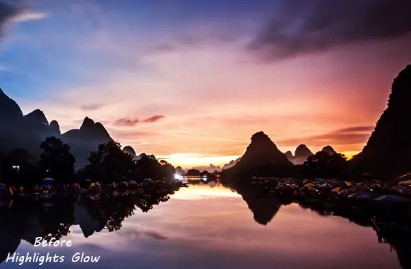
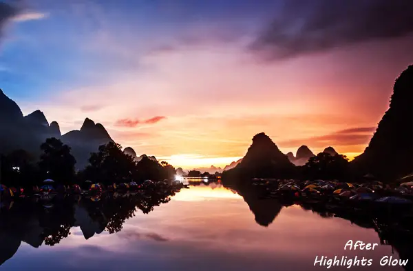
- Highlights Glow: Landscape photos with dreamy, soft highlights are very popular right now. It’s a little too complex to go into here, but an action to produce the highlights glow is provided in the free Photoshop Colour Control ActionPack. Alternatively, you can find out how to make the effect yourself, and see how best to use it in the ‘How to Make Your Sunsets Glow’ video below.
17. Tidying Up
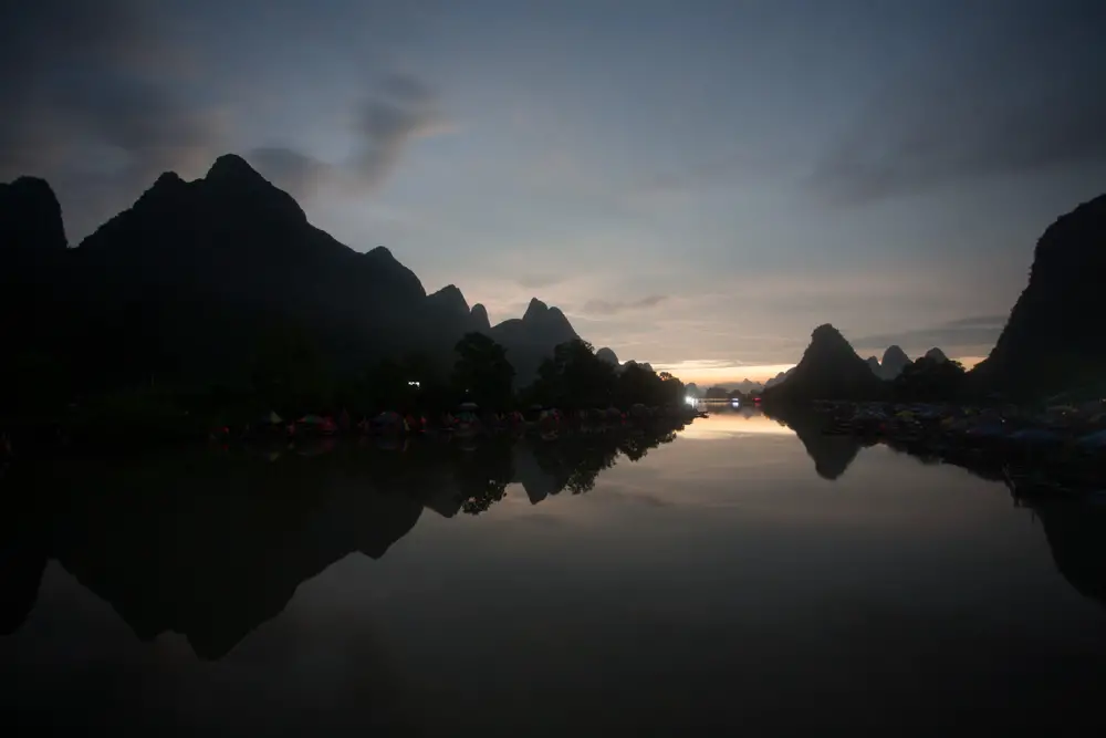
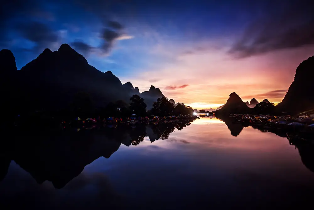
We’re nearly there! To make your photos look the best they can be when you display them online and in print, they will need to be sharpened and you may want to reduce noise, particularly if you have shot at a high ISO, like I did with the Li River shot we’ve been working on.
- Sharpening: There are a lot of ways to sharpen your photos, some good, some not so good. I’ve recorded a video on the best methods and how to use them, shown below.
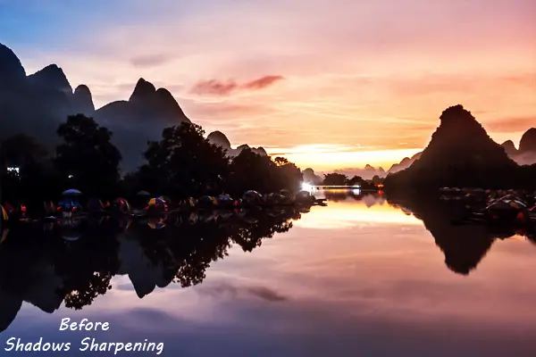
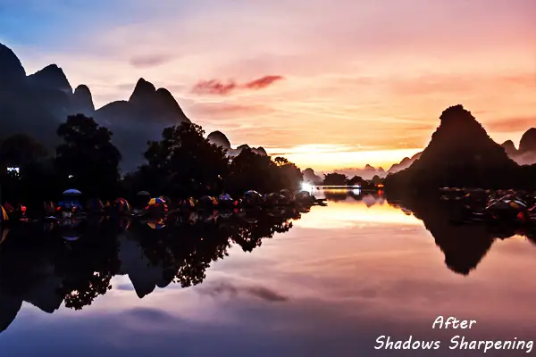
For the Li River photo, I used the ‘Shadows Sharpening’ action from the Photoshop Colour Control ActionPack. This is a two part action that boosts detail and sharpens edges separately, and only in the shadow regions of a photo. I go over how to make it yourself and how it works in the ‘Sharpen Your Photos the Right Way’ tutorial.
Generally, you don’t want to sharpen highlights (ie. the sky), as highlights should be soft. Think about the bright points of light you see with your eyes. Brighter objects are harder to look at, are harder to focus on, and so you see less detail in them than in darker objects. Sharpening only the darker areas has the effect of making the entire photo appear sharp, but keeps a softness in the sky and highlights. See the before/after for an example.
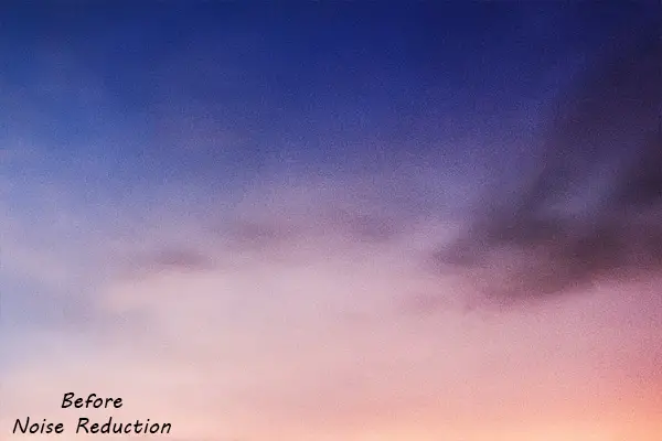
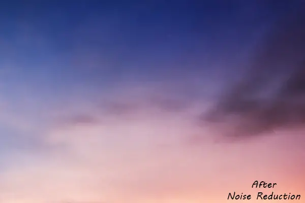
- Noise Reduction: The higher the ISO you shoot at, the noisier a photo will be. Areas of even tone will show the noise most clearly. Areas with heavy texture or uneven tone can hide the noise, so you usually only need to perform noise reduction on skies.
- Stamp visible to new layer with ‘ctrl-shift-alt-e’
- Apply Surface Blur filter from the ‘Filter – Blur’ menu at a radius of 5 pixels and a threshold of 25
- Using a layer mask, paint out the non-sky areas that you don’t want to blur
The surface blur tool works particularly well to remove noise from the sky, as unlike most other blur options, it doesn’t cause the sky to lose too much contrast. A noise reduction action is available in the free Photoshop Colour Control ActionPack.
- Dust Removal: I always leave any dust spots I couldn’t remove in Lightroom until the end. The changes in contrast and colour as you process your photo will always bring out more dust than you wouldn’t have spotted at the beginning. Leaving dust removal until the end means that you only have to do it once.
- Add a new, blank layer
- Select the Spot Healing Brush from the tools palette. Make sure it is set to sample all layers
- Zoom in to 100% and paint the spot healing brush over any dust spots. For larger areas of dust, you may need to use the Patch tool, located next to the healing brush on the tools palette. Both are accessible with the shortcut key ‘j’
18. The Finished Photo
Phew! After all that, you finally have a finished photo, ready to share online or print or whatever. Here’s mine:
It’s not a subtle effect(!), but it could be. I’ve deliberately pushed this to show you what these tips and tricks are capable of. Have a look at my favourite photos created using these techniques to get a full overview.
Anyway, I hope you’ve made something you are proud of. I’d love to see what you’ve done. Why not show me?
Get the Free eBook!
Download this article as a free 59-page PDF eBook to reference when processing your photos.
Put your email address in below to sign up for my newsletter and get sent a download link right now.
This tutorial is only a small part of the free learning resources available on this site. If you’ve enjoyed this, then why not sign up for my weekly email full of tips and tricks just like this. You also get access to the Library and the free resources inside it. This includes the Lightroom Develop System, containing over 1000 stackable presets that I have designed specifically for landscape and cityscape photographers, the Photoshop Colour Control ActionPack, a series of powerful actions for Photoshop to give you full control over colour grading and your workflows, and the Photoshop Landscape Colour Grades, which can give you a solid colour baseline for your photos. I also have plenty more tutorials freely available to you. Take a look at the start here page for the best ones, and join the newsletter below if you want more.
Get the most powerful add-ons for Lightroom and Photoshop!Subscribe to the mailing list and get a free download link right now
Hope to see you again!
Tim
While you’re here, why not read my Best Long Form Photography Tutorials & Guides …
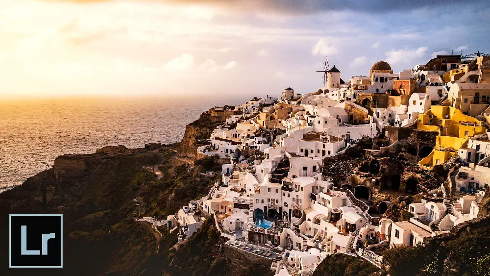
Lightroom Tutorial – Adding Color Depth with White Balance
Using targeted white balance adjustments, you can enhance sunrises, paint in new sunsets, make stormy skies pop, create stylised effects, and much more, all with very little time and effort. Learn how to do this entirely in Lightroom
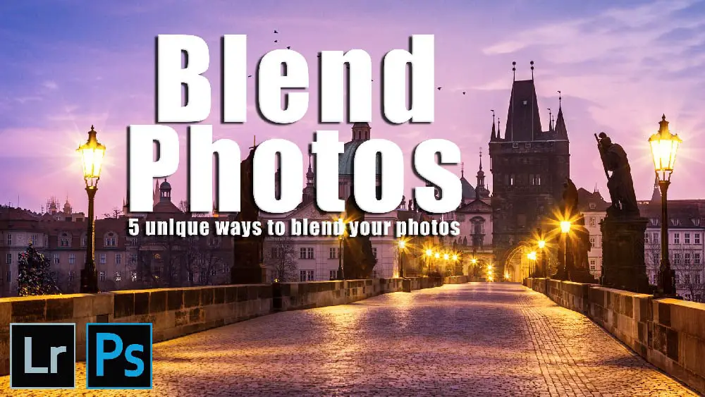
Photoshop Tutorial – Blend Any Two Photos
This tutorial covers methods of blending in five common landscape situations: Multiple Exposure Blending; Time Blending; Object Blending; Double-Process Blending; Blending Skies.
These powerful methods will help you blend photos in any situation.
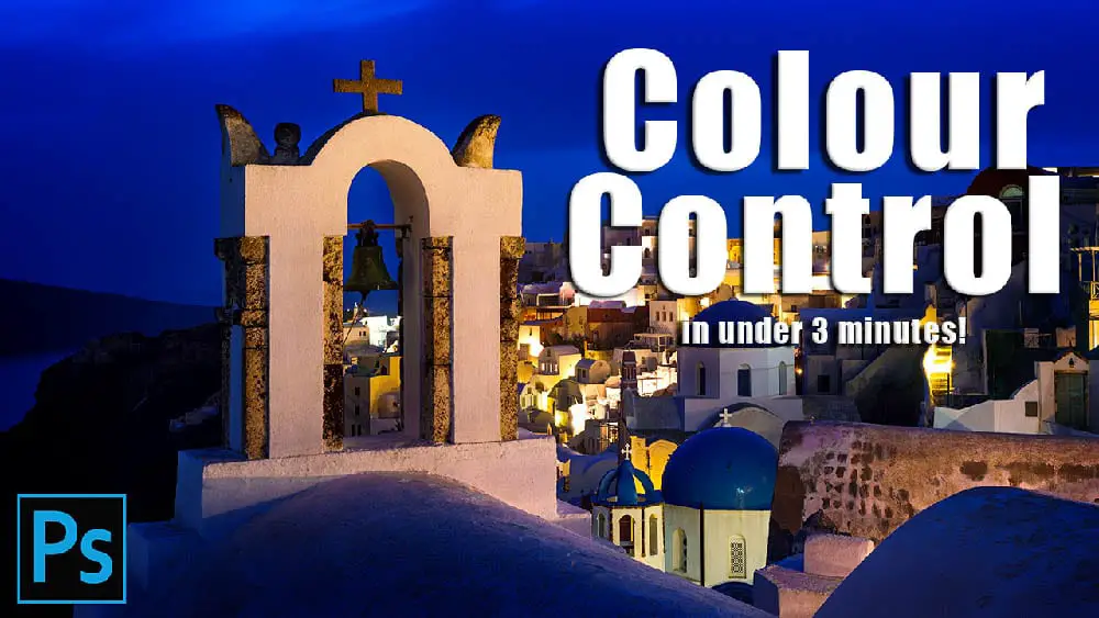
Color Control in Your Photography Tutorial
“I’ve blended my exposures, but my photo still doesn’t look like how I want it to look. Now what?”
Learn a two-and-a-half minute, Photoshop based workflow to fix both colour and tone in this long form tutorial and video series.
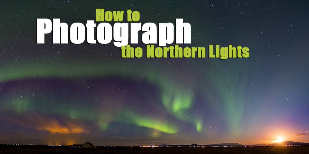
Northern Lights Photography Tutorial
This guide covers how to see the Northern Lights – when, & where, the ideal camera equipment you should use, the camera settings you need to get perfect photos, and how to process your photos to get something you can be proud of, along with much more…
Leave a Reply