This site is part of various affiliate programs. Links may give us a small compensation for any purchases you make, at no additional cost to you. Please read the disclaimer policy for full details.
My top choice is the EIZO ColorEdge CS2740, although if this is beyond your budget, then the LG 27UK500 is an excellent cheap monitor for digital art.
There are a lot of monitors aimed at artists that all seem to be the same. How do you separate them into good and bad, and know that you have made the right choice before clicking the buy button?
I know how important a good monitor is from my own work, and I have spent many hours researching and testing monitors, just so that I could have the best monitor for digital art.
Rather than let this research go to waste, this article contains everything I’ve learned in my full reviews, as well as the key points you should look out for when looking at monitors for artists. So that the article isn’t overwhelming, I have only included monitors that meet my strict criteria:
- Full HD (1080p) Resolution at a minimum, but 4K is preferred
- IPS Panels, rather than VA or TN
- 100% of the sRGB color gamut, or thereabouts for maximum color accuracy
- At least a 27-inch screen as this is the sweet spot for digital art
I have cut out any monitors that don’t meet these strict criteria, so you are left with only the best monitors for digital art.
The Best Monitor for Digital Artists
The Best Monitor for Artists
- 27-inch display with 99% of the Adobe RGB gamut
- 16-bit internal LUT tables translated into a 10-bit display
- Excellent factory color calibration
- Prints will look identical to how they look on screen
- The ultimate in panel uniformity for brightness and color, plus the deepest blacks you can find on an IPS panel
The Best Budget Monitor for Digital Art
Best Monitor for Photo Editing on a Budget
- 27 inch, 4K Display
- 98% of the sRGB color gamut in an IPS panel
- Fantastic color accuracy and reproduction
- Clear and sharp display
- Pretty much the perfect specs and price for a budget photo editing monitor
Note: The two letters in the names of LG monitors refer to the year they were produced. The UK model was first manufactured in 2018, the UL model in 2019 and UN in 2020. The three digit number at the end refers to the inclusion of extra features, like a movable stand and speakers. In terms of display technology, there is almost no difference, so my advice would be to go for whichever is currently the cheapest out of the 27UK500, the 27UL500, or the 27UN850 (which has a movable stand and USB-C).
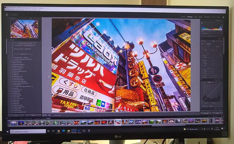
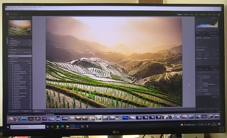
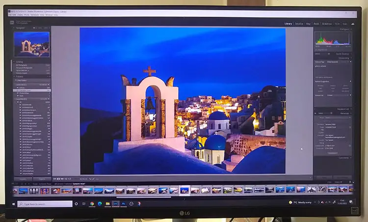
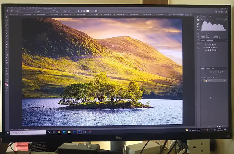
This is the monitor I use, and highly recommend it for its color accuracy and overall screen quality. Here’s some photos of it in use, with more in the review section further down this article.
Comparison of the Best Monitors for Artists
Monitor | Screen Size | Resolution | Color Space | Price | |
[The Best Monitor for Artists] | 27" | 4K (3840×2160) | 99% Adobe RGB (~140% sRGB) | ||
| 27" | 4K (3840×2160) | 98% sRGB | ||
27" | 4K (3840×2160) | 109% sRGB | |||
27" | 4K (3840×2160) | 99% sRGB | |||
27" | 1440p (2560×1440) | 100% sRGB | |||
27" | QHD (2560×1440) | ~97% Adobe RGB 140% sRGB | |||
27" | 1080p (1920×1080) | 99% sRGB |
The Two Most Important Requirements for Monitors for Artists
If you don’t want to delve into the detailed technical specifications of each monitor, that’s fine, but there are two important requirements that you should always keep in mind:
- Panel Type
- Color Space
Although neither of these characteristics are usually given top billing in the marketing materials, they are both indicative of a high quality monitor to a much greater degree than more common criteria like resolution or screen size.
Cheaper monitors tend not to do well on either panel type or color space metrics, so these can be used to effectively separate out the good monitors from the bad.

Panel Type refers to the design and architecture of the display panel. You can read more about the details below, but it is sufficient to know that IPS panels are currently the best you will find in monitors for artists. If you see that the panel is either TN or VA, you know that viewing angles and colors will be worse. OLED panels are now starting to appear in computer monitors and have excellent color reproduction, but suffer from lack of brightness, poor lifetime and high cost, so are not yet really suitable for general consumer use.
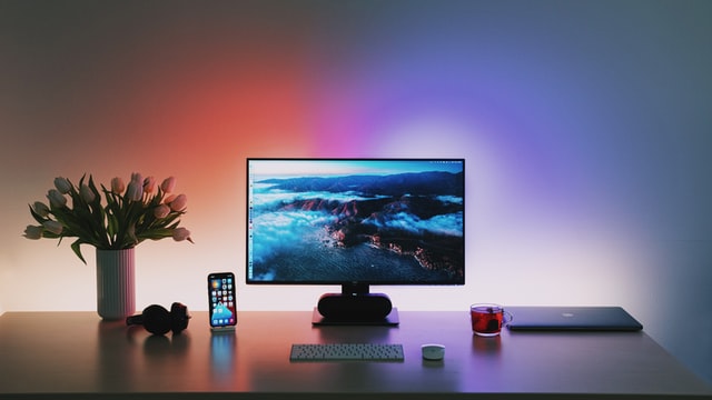
Color Space refers to the total number of distinct colors that a monitor can display, as well as the subtle gradations between colors. The standard color space of the Internet is sRGB, which itself contains about 35% of the colors visible to the human eye (colors lost are those subtle shades that are usually difficult to notice), while professional designers and artists rely on the Adobe RGB color space, which has about 50% of visible colors, with better cyan-green accuracy than sRGB.
At a bare minimum, you should be looking for a monitor that hits 100% of the sRGB gamut, although if you are making money from your art or graphic designs, you might want to consider a monitor that hits 100% of the Adobe RGB gamut for maximum color fidelity.
Checklist to Decide on the Best Monitor for Drawing & Art
In order to separate monitors into good and bad when looking for the best monitor for drawing and art, I used the below checklist to score each model. The criteria are listed in full in order of importance. Feel free to use this list for your own research.
1. Panel Type
As already discussed, IPS panels are considered the top display architecture. Bear in mind that all panels can suffer from backlight bleed, where brightness is uneven across the screen, with more details on this in the full reviews.
IPS panels offer very wide viewing angles with consistent colors across the panel. Color reproduction in particular is the closest that you will get to real-world levels (outside of OLED panels), although you do typically see lower response rates, making these less suitable for gaming. IPS panels can exhibit IPS glow, a white glow typically in the edges but potentially anywhere on the screen, but I wouldn’t worry about this, as it only tends to be visible when viewing a fully black screen.
VA panels offer better contrast than IPS panels, with deeper blacks, making them potentially more suitable if you are only concerned with editing black and white images. But, viewing angles are worse than IPS panels, with inconsistent contrast and colors as you change your viewing position, making them less suitable for serious work in general.
TN panels offer the worst viewing angles, contrast and color consistency of any panel type, and should be avoided. They are found in the cheapest monitors and laptop screens.
2. Color Space
This is a measure of how many colors a monitor can display, including the subtle shades as colors blend into one another. The larger the amount of colors, the less banding you are likely to see as colors merge. Manufacturers often use different color spaces, so it can be difficult to compare models. The two most common color spaces are:
sRGB is the default gamut of the Internet, despite being one of the smallest color spaces. For pretty much everyone, a monitor that hits 100% of the sRGB gamut is good enough – I’ve even used monitors like this for professional work.
Adobe RGB (1998) – The best design monitor from Eizo hits nearly 100% of the Adobe RGB gamut, which is significantly larger than sRGB, covering extra shades of cyan-green. If you have done any professional image work, you will be aware that every design company requires images in this color space.
3. Resolution
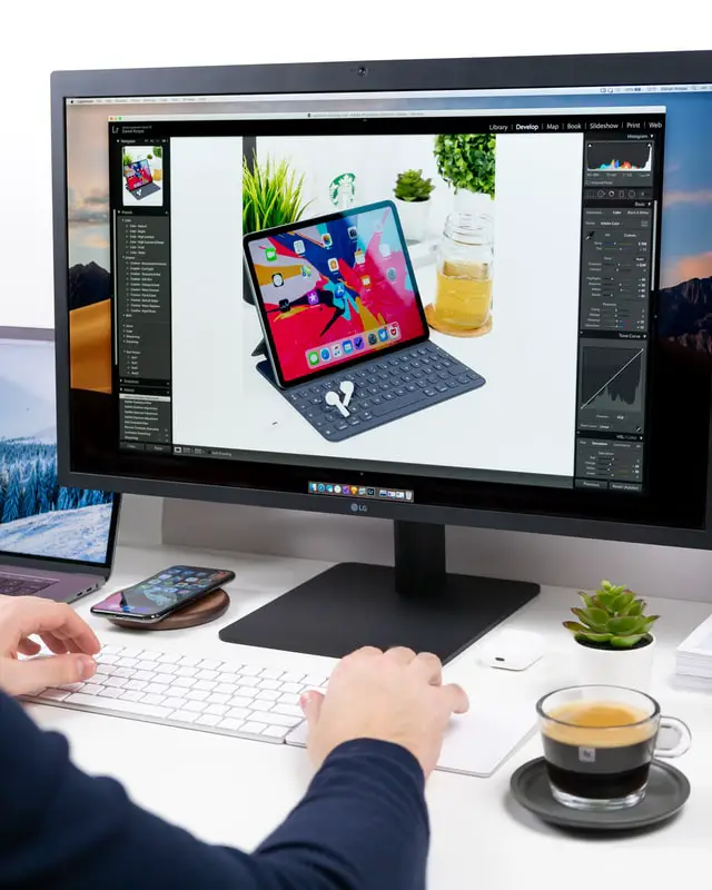
A higher resolution means a higher pixel density, which means that your images will be sharper and clearer, and lets you see details in your images without having to zoom in. I prefer a higher resolution screen over a larger screen size in general, as resolution increases usability much more than size. All of the monitors here have a resolution of at least 1080p (1920 x 1080), with a number of 4K monitors for designers (3840 x 2160) the better choice.
4. Screen Size
I feel that the ideal size for a monitor for art, drawing, graphic design or photo editing is 27-inches. This gives you enough screen real estate to see you image, but also have any palettes, tools and layers open, without compromising on space. Most manufacturers use screen size as their main selling point, and often cut down on panel type, resolution and color space to achieve a higher screen size without increasing price.
Therefore, it can make more sense, if you are on a budget, to buy a smaller monitor in order to ensure you get an IPS panel with good resolution and large color gamut.
5. Additional Points to Consider
Ability to Rotate. Using your monitor in a vertical orientation can be aid completing artwork that is in a portrait orientation, as it better fills the available screen.
Response Time & Refresh Rate are not so relevant for artists, but a higher refresh rate (> 50 Hz) and quicker response time (< 10 ms) will give you a smoother experience when using your computer.
Brightness might be relevant if you are using your monitor in direct sunlight, but hopefully you have you desk in a more suitable location.
HDR Capabilities can give you an idea of the standards that monitors meet. Read my articles about HDR400 vs HDR600 and HDR10 vs HDR400 to learn more about this area.
How to Make Sure Your Monitor is Properly Calibrated
Unless you buy one of the premium monitors from Eizo which have been factory calibrated, you will need to color calibrate your monitor when you get it home.
Most manufacturers provide some basic calibration which they detail in a sheet inside the box, but this is aimed at general users, rather than artists.
So, before using your new monitor, you should calibrate it for color accuracy.
- Least Effective: Use the Windows ‘Calibrate Display Color’ tool, or use a website that shows test images, then manually calibrate the colors and brightness on your monitor using the on-screen menu. Note that this is not a very good approach if you are serious about your art.
- Most Effective: Get a hardware calibration device, like the Datacolor SpyderX Pro and either use the included software, or better yet use open source software like DisplayCAL. This will automatically calibrate your monitor, and save the results as a color profile that your computer will load on starting each time. Running this every month or so will ensure that you always get accurate colors. This needs to be repeated at regular intervals as the color response of the pixels in your monitor will degrade over time. As this degradation is not uniform, you will need to re-calibrate to keep colors accurate.
You might not think that calibration matters than much, but I know from personal experience how wrong this view is.
Before I started regularly calibrating my monitors, I would have issues with prints not looking quite how I wanted, and with images having poor colors when viewed on other devices.
I never used to calibrate my displays, but with hindsight I can see that this is why my photos never seemed to have quite the correct colors, either printed or when I viewed them online. Of course, calibration doesn’t solve all problems, but it does give your art its best chance to look good, and to not seem ‘off’ in future.
Reviews of the Best Monitors for Graphic Design & Art
Read the full reviews of all artist monitors below, ordered from best to worst. Remember though that every monitor here is very good for most uses, or it would not have been included. A variety of monitors are included to make sure that there is something appropriate for your specific situation.
1. EIZO ColorEdge CS2740
The Best IPS Monitor for Graphic Design
- Panel Type: IPS
- Screen Size: 27″
- Resolution: 4K (3840×2160)
- Color Gamut: 99% Adobe RGB
- Bit Depth: 10-bit
- Response Time: 13 ms
- Refresh Rate: 60 Hz
- Dimensions: 9.65 x 25.12 x 15.91″
- Pros:
- Nearly 100% of the Adobe RGB color gamut in a 10-bit IPS panel
- Outstanding color reproduction and contrast that can’t be beaten
- Excellent factory color calibration
- Resolution feels like 4K in practice, thanks to the high-end design
- Plenty of connections and output ports
- Panel uniformity is superb, with no color or brightness hot spots
- Cons:
- Slower response time, making this unsuitable for gaming but doesn’t affect art uses
- Expensive
The Eizo CG series of monitors are aimed at professional users and design agencies, that will be using their monitors constantly, and require precise color accuracy.
But the less expensive Eizo CS series, which this monitor is one of, are largely the same as the CG monitors, only they do not include a built-in hardware color calibrator, and contrast levels are lower.
Picture Quality
There is nothing negative to say about the picture quality of the Eizo. Colors are rich and vibrant, and make the screen feel like it has a 4K resolution, despite being slightly under this.
Any prints that you make are identical to how they look on screen thanks to the excellent built-in hardware calibration device which operates independently of your computer, and the 10-bit display resolution.
If you are a a graphic designer or artist who needs ultimate color accuracy, then the 99% of the Adobe RGB gamut that the Eizo displays can’t be beaten in consumer monitors.
Overall
Without a doubt, the Eizo is the best monitor for graphic design, with no real negative points for artists, other than perhaps its high cost. But once you have used it, you will feel that even the high price is justified.
2. LG 27UK500
Best Cheap Monitor for Artists
- Panel Type: IPS
- Screen Size: 27″
- Resolution: 4K (3840×2160)
- Color Gamut: 98% sRGB
- Bit Depth: 8-bit
- Response Time: 5 ms
- Refresh Rate: 60 Hz
- Dimensions: 24.5 x 14.6 x 2.9″
- Pros:
- The best color accuracy of any monitor reviewed here
- Sharp, clear display that is a pleasure to use
- Flicker-free backlight
- In-depth on-screen menu with joystick control
- Can use Radeon FreeSync
- Excellent price for the features and high build quality, and the best budget IPS monitor for drawing
- Cons:
- No speakers unless you buy a more expensive model
The LG is a monitor that I have used for the last few years for photo editing. Not only have I found it to be an excellent monitor, but there have never been any problems with either setup or long term reliability, and with the current low price, this is quite the steal.
Picture Quality
Many display panels for other brands of monitor are actually made by LG, as they have some of the most efficient manufacturing processes to create panels. By putting an LG panel into an LG monitor, you get to really see the quality of the display, with vibrant, saturated colors, and no noticeable banding.
Factory calibration isn’t quite up to the Eizo level, meaning that you will need to re-calibrate yourself, but color accuracy is otherwise excellent, and the high pixel density of the monitor and 4K resolution really shows you details of your art that you wouldn’t normally see.
There is no noticeable backlight bleeding and hardly any IPS glow, which in practice you will not notice.
Overall
The advantage of having additional features like Radeon’s FreeSync, means that if you have a compatible video card in your computer, you should not see any blurriness when scrolling windows. This is a feature that you rarely see on the more budget monitors, and really makes this one stand out.
You might expect a high price for this feature set and quality, but being available at its current price it is a fantastic value for money, and the best monitor for drawing and for art for the average user.
Note: The two letters in the names of LG monitors refer to the year they were produced. The UK model was first manufactured in 2018, the UL model in 2019 and UN in 2020. The three digit number at the end refers to the inclusion of extra features, like a movable stand and speakers. In terms of display technology, there is almost no difference, so my advice would be to go for whichever is currently the cheapest out of the 27UK500, the 27UL500, or the 27UN850 (which has a movable stand and USB-C).
3. GIGABYTE M27Q
140% sRGB Color Space
- Panel Type: IPS
- Screen Size: 27″
- Resolution: QHD (2560 x 1440)
- Color Gamut: 140% sRGB
- Bit Depth: 10-bit
- Response Time: 0.5 ms
- Refresh Rate: 170 Hz
- Dimensions: 28.3 x 7.9 x 18.5″
- Pros:
- Very high 140% of the sRGB color space captures subtle shades of color
- Quick response rate and high refresh rate also make this suitable for gaming and video editing
- 27-inch screen with QHD resolution
- Very reasonable price for the feature set
- Around 97% of Adobe RGB color gamut, close to much more ezxpensive Eizo models
- Calibration out of the box is very good
- Cons:
- Poor support – Gigabyte are known more for PC components than consumer products
- Some light bleed noticeable – lack of panel uniformity and low contrast meaning you need to use this in a dark room
Gigabyte are known as a maker of PC components, but they know also venture into direct consumer products like monitors. This version offers many qualities that are usually only found on much more expensive monitors, but at a budget price.
Picture Quality
Although the panel uniformity is a little off, with blacks seeming quite gray, the Gigabyte is still a fantastic monitor. You will struggle to use this for serious black and white work, and in bright rooms more generally, but it works very well in a standard artist studio.
Perhaps the real killer feature is the 140% of the sRGB gamut (and around 97% of the Adobe RGB gamut) which nearly matches that of the Eizo. As you would expect, colors look beautiful, with all subtle shades that you would expect present. This is helped by the well done factory calibration, although you will still want to re-calibrate with your own tools.
Overall
The Gigabyte M27Q is a very capable monitor that punches well above its weight in color display. Although there are some small issues with panel uniformity, and customer service is less easy to access than with other brands, the Gigabyte is well positioned to be the monitor of choice for those who also want to game or edit videos with its 170 Hz refresh rate, or for professionals who need a monitor that can get close to 100% of the Adobe RGB gamut.
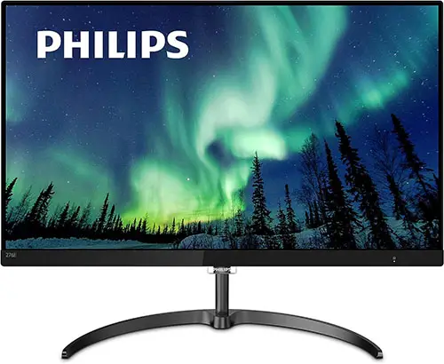
4. Philips 276E8VJSB
Best Monitor for Photo Editing Under $300
- Panel Type: IPS
- Screen Size: 27″
- Resolution: 4K (3840×2160)
- Color Gamut: 109% sRGB
- Bit Depth: 10-bit
- Response Time: 5 ms
- Refresh Rate: 60 Hz
- Dimensions: 24.13 x 7.44 x 18.35″
- Pros:
- Lots of detail and clarity in images
- Flicker-free with a 10-bit panel for smooth color gradations
- Very thin and easy to fit on a desk
- Fantastic value for money
- Includes 4-year advanced replacement
- Cons:
- Minimal ports
- No VESA mount, so cannot be placed on a separate monitor arm
If a low price is important to you, then Philips make some of the cheapest 27-inch 4K monitors that still offer fantastic color accuracy and contrast, which is particularly impressive given that this monitor also includes a 10-bit panel.
Picture Quality
Based on the sRGB range, you would assume this would be the top monitor, but a side-by-side comparison with the LG 27 inch monitor that is the recommended budget screen here, shows that color consistency and accuracy across the panel is lacking (though is still very good for the price). You would want to look to the LG for more professional uses, but this Philips is still an excellent choice for most home users, as in practice you may not even notice the difference.
Overall
Really though, I’m just being picky in finding issues with the Philips. It is a genuinely excellent monitor for a very reasonable price, and if you are willing to overlook the small flaws, you will essentially get a high-end artist monitor at a budget price.
5. Dell S2721Q
Best Dell Monitor for Artists
- Panel Type: IPS
- Screen Size: 27″
- Resolution: 4K (3840×2160)
- Color Gamut: 99% sRGB
- Bit Depth: 10-bit
- Response Time: 4 ms
- Refresh Rate: 60 Hz
- Dimensions (WxHxD): 21.2 x 16.3 x 6.1″
- Pros:
- Fantastic color accuracy possible after calibration
- 10-bit color depth for beautiful color gradients and smooth gradations
- High pixel density for sharp, clear images
- Wide range of movements possible, including to vertical
- Can use Dell software to change settings without having to go into the menus
- Cons:
- Contrast is only ok, with blacks still fairly gray
- Sides are noticeably darker than the center when viewing dark images
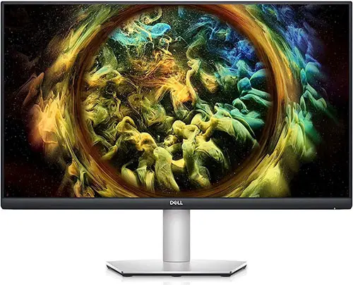
Dell are another well-known brand that have been manufacturing monitors for many years. As one of the most recently released models reviewed here, the Dell’s build quality feels like a much more premium model, with a mount that offers lots of possible adjustments to position, including the option to switch the screen to a vertical layout for editing portraits.
Picture Quality
With nearly the entire sRGB color gamut displayed by the Dell, and very high pixel density, photos, drawings and art look outstanding on this screen, making editing a pleasure.
10-bit color depth, which only tends to be found on more premium monitors like this, offers smooth color gradients and no visible banding as colors transition.
Overall
This is really an outstanding monitor, with the only negatives being related to the backlight not allowing the blacks to go fully dark, but remaining slightly gray. This is common among all similar monitors though, and is not an issue unless you are primarily editing black and white images, or are working professionally.
Note: There is also a curved screen version available, the Dell S2721QS for around the same price, if you would prefer to work on a curved monitor.
6. ASUS ProArt Display PA278QV
The ProArt models are well known for color accuracy
- Panel Type: IPS
- Screen Size: 27″
- Resolution: QHD (2560×1440)
- Color Gamut: 100% sRGB
- Bit Depth: 10-bit
- Response Time: 5 ms
- Refresh Rate: 75 Hz
- Dimensions (WxHxD): 24.2 x 14.6 x 2″
- Pros:
- Fantastic price for such a high-quality 27″ monitor
- Excellent color reproduction
- Lots of adjustment options for the mount
- Plenty of ports
- Aimed at professional users on a budget
- Cons:
- Grainy anti-glare coating
- Potential flicker from the backlight
- Lower contrast and less uniform blacks across the panel
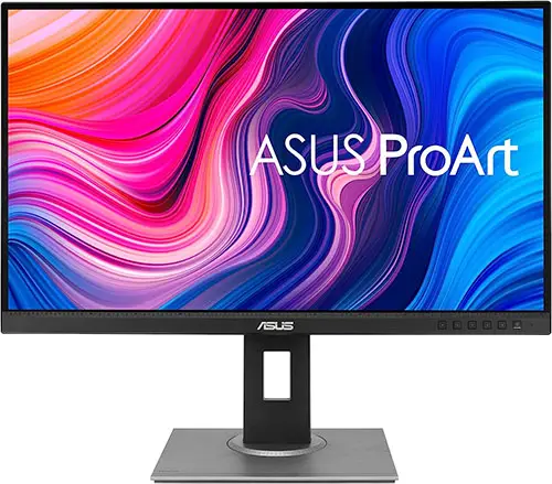
The Asus ProArt series are highly regarded in the hobby artist world, thanks to their color accuracy and low price, along with a large 27-inch screen size and IPS panel. he price of the ProArt is very attractive for a 27-inch display, but this can be partly explained by the sub-4K resolution, which is a reasonable trade-off for the high build quality of the screen.
Picture Quality
As with other monitors that exhibit excellent color reproduction, the Asus uses an LG panel, but unfortunately this has been paired with a grainy anti-glare coating which is not usually found on modern monitors, and can cause some images to appear lower quality than they actually are.
In keeping with this older style of design, the backlight is controlled by pulse width modulation (PWM), a method of reducing brightness that can cause flickering although this is at a high enough frequency (>1000 Hz) that it shouldn’t be noticeable to most people.
Overall
Although the ProArt shows excellent color fidelity, the anti-glare coating and lack of panel uniformity let it down, particularly now that there are so many other excellent monitor options around.
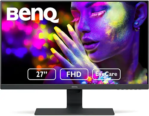
7. BenQ GW2780
Best Monitor for Photo Editing Under $200
- Panel Type: IPS
- Screen Size: 27″
- Resolution: 1080p (1920×1080)
- Color Gamut: 99% sRGB
- Response Time: 5 ms
- Refresh Rate: 60 Hz
- Dimensions (WxHxD): 24.1 x 18.2 x 7.2″
- Pros:
- Nearly the entire sRGB gamut is covered
- Minimal IPS glow and backlight bleeding
- Low price for a 27″ monitor
- Cons:
- Darker grays and blacks show some banding
- Basic on-screen menus
- No USB ports
If you are on a very strict budget, and need a monitor for under $200, then the best that you are likely to find is this BenQ model. Bear in mind that there are compromises on resolution and panel quality, but for the price, you get a very good 27-inch screen.
Picture Quality
With 99% of the sRGB gamut, this is pretty much perfect from a color standpoint for art, and is at the top end of what you will find at this price point. The display does fall down a little in blacks and darker grays, with the black point being relatively high, and some banding present in the darker gradations, but neither of these issues are fatal, unless you spend a lot of time processing black and white photos.
The minimal IPS glow and lack of backlight bleeding are welcome, and show you that care has been taken in the construction of the monitor, with high quality components used internally at least. Bear in mind that you are stuck with 1080p in a 27 inch frame, meaning that pixel density is pretty low and therefore images are not as sharp as on other monitors.
Overall
Although the BenQ is noticeable at the cheaper end of the market, with a less premium feel to the case, basic on-screen menus and no 4K, none of these issues override the very low price that this is on offer for, and means that this is still value for money.
Read More:
What is the best monitor for photo editing on a budget?






Leave a Reply